Menu
Upsolut was founded by two environmentalist women who are commited towards creating a circular economy and zero waste lifestyles. They help enterprises and communities to convert their „garbage” into a new product. An example is the kind of team-building workshops they organize where the employees can create laptop sleeves or bags from old molinos and roll-ups.
Logo design
Visual identity
Brand strategy
Webdesign
Content strategy


The biggest challenge was that we had to communicate about the services clearly and simply, the way we would talk to an elementary school student. Most people do not have any ideas what upcycling or circular economy are.
In the research phase the most important thing was to explore what potential clients thought when they heard about the services. These questions helped us to create the website’s structure and make the service process’ more understandable for clients.
Our answer to all questions was creating content. Blog articles about sustainability and circular economy, or online DIY workshops for people who might want to learn how they can sew a bag from a tent. The most important kinds of content are case studies. These present knowledge and showcase Upsolut’s capabilities and experiences.

The main target groups are big companies and their mid-level leaders who are responsible for the environmental strategy. We had to explore their thoughts and situations they might face so we made a map based on the „empathy-map”.
We wanted to know what most green-problems are and if they really are the problems or we must dig deeper. The companies are pushed from two sides. There is one from society, from the customers, and the other one comes from the government. These helped define the goals.
The biggest problem is the lack of sources because upcycling is a small but knowledge intensive discipline. The companies therefore expect lead and management in these topics.


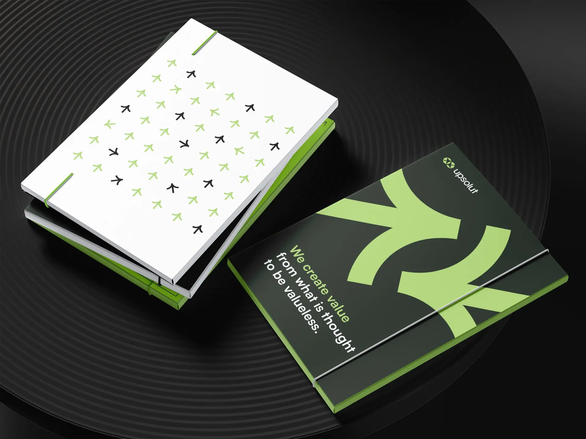
The activites the Upsolut team organises use lots of different materials so we had to create an indentity design that would work on textil, plastic, re-paper etc. The identity uses a few elements but these are bold and massive so they stand out. The design has lots of white space because we wanted the design to use as little paint as possible.
The arrows in the brand come from the logo as we played around with them. We can use these to create pins, badges, or other brand elements.


We wanted to pay attention to green-goals in the online space as well. The offline indentity has a light visual with lots of white space but on screen we save more energy with dark tones. We use very few images but we must make a compromise to not sacrifice enjoyability.
The content and information architecture are based on research. Currently we use an MVP (Minimum viable product). We will use this information to bring the current site to a new, final website along the same principles.


