Menu
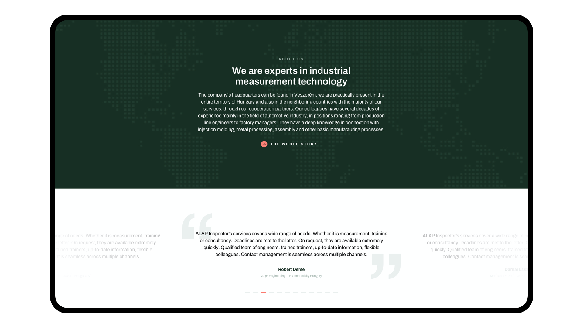
Alap Inspektor’ is an industry measurement technics company, a supplier for multiple global car companies. The purpose of the rebranding was to create a design that not only signals a market leader but a company that is the industry itself.
Logo design
Brand design
Webdesign


When creating the entire brand, the engineering aspect was an important one. It came up during the branding sprint as a potential company value. Every element of the visual design is well thought out, measured, and in proportion to other elements.


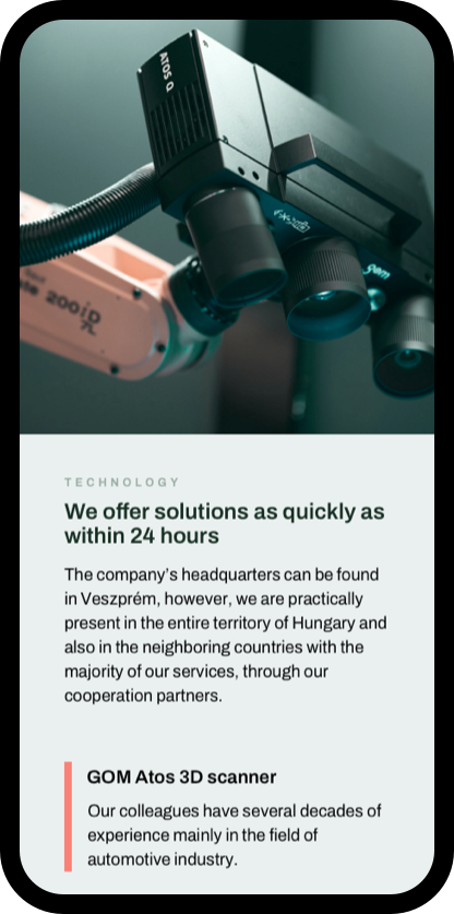
The most important element of the image is the colour green. It’s also a great way to brand your images, as we’ve created a filter that can be applied to all images.
The logo cut-out is also a recurring element, positioned in the corners of the different materials.


When choosing the colors for the brand an important aspect was to signal that this is a serious, innovative, market-leading company. Dark pastel green colors carry this message but are less attention-grabbing, so we needed a call-to-action color as well that can be used both online and on prints.


